Client.
Greiner AG
Servies.
Branding & Design UX & UI Design Websites & web-based applications Conversion Optimization & Web Analytics Technical implementation SEO Copywriting and Editing
Core team.
Greiner is a leading global provider of plastic and foam solutions with headquarters in Upper Austria. Three operating divisions produce and market innovative solutions for the packaging, mattress, furniture and sports industries, for the mobility sector as well as for medical technology and the pharmaceutical sector, among others. Greiner was founded in 1868 and today provides secure jobs for more than 10,500 people in over 30 countries.
The aim of the project was to upgrade the Greiner B2B brand and raise it to the level of an international corporation. To this end, the corporate design was revamped and the corporate website was completely relaunched.
Client.
Greiner AG
Servies.
Branding & Design UX & UI Design Websites & web-based applications Conversion Optimization & Web Analytics Technical implementation SEO Copywriting and Editing
Core team.







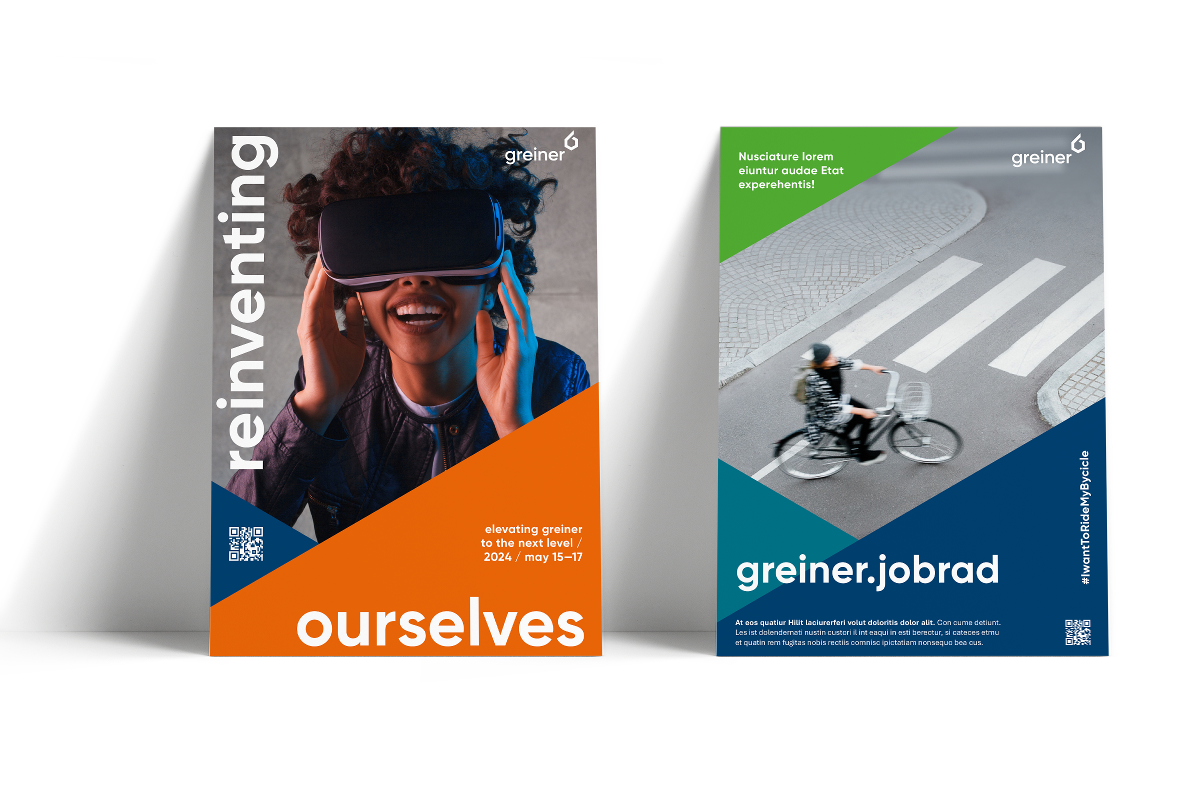
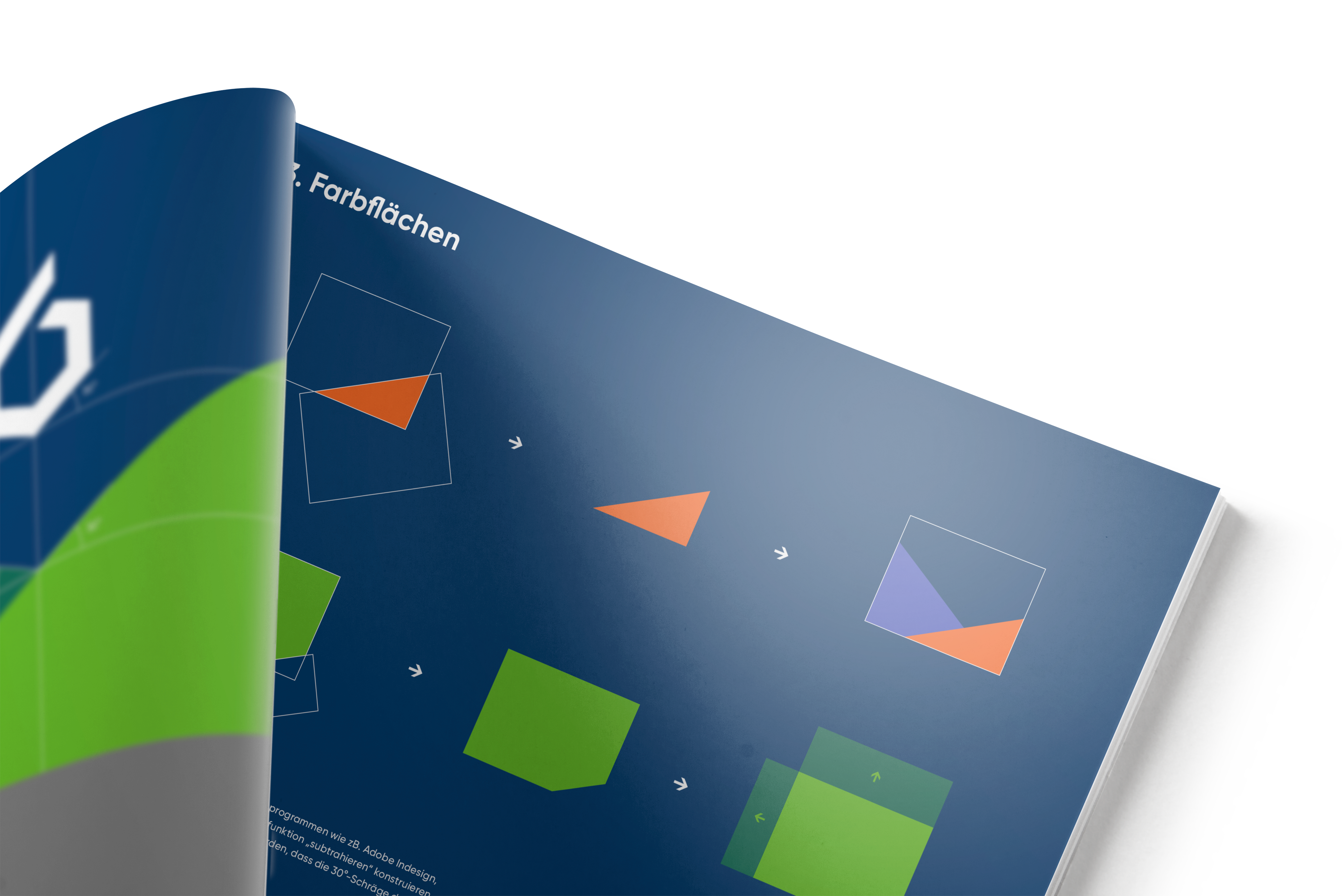
The new corporate design relies on independent shapes that result from the logo as well as strong colours in combination with strong images and videos.
Following the creation of the new basic CD, mutations were developed for all relevant applications and media channels and documented in a design guide:
In addition, the interplay between Greiner AG as an umbrella brand and the individual divisional brands (Greiner Packaging, Neveon, Greiner Bio One) was defined.
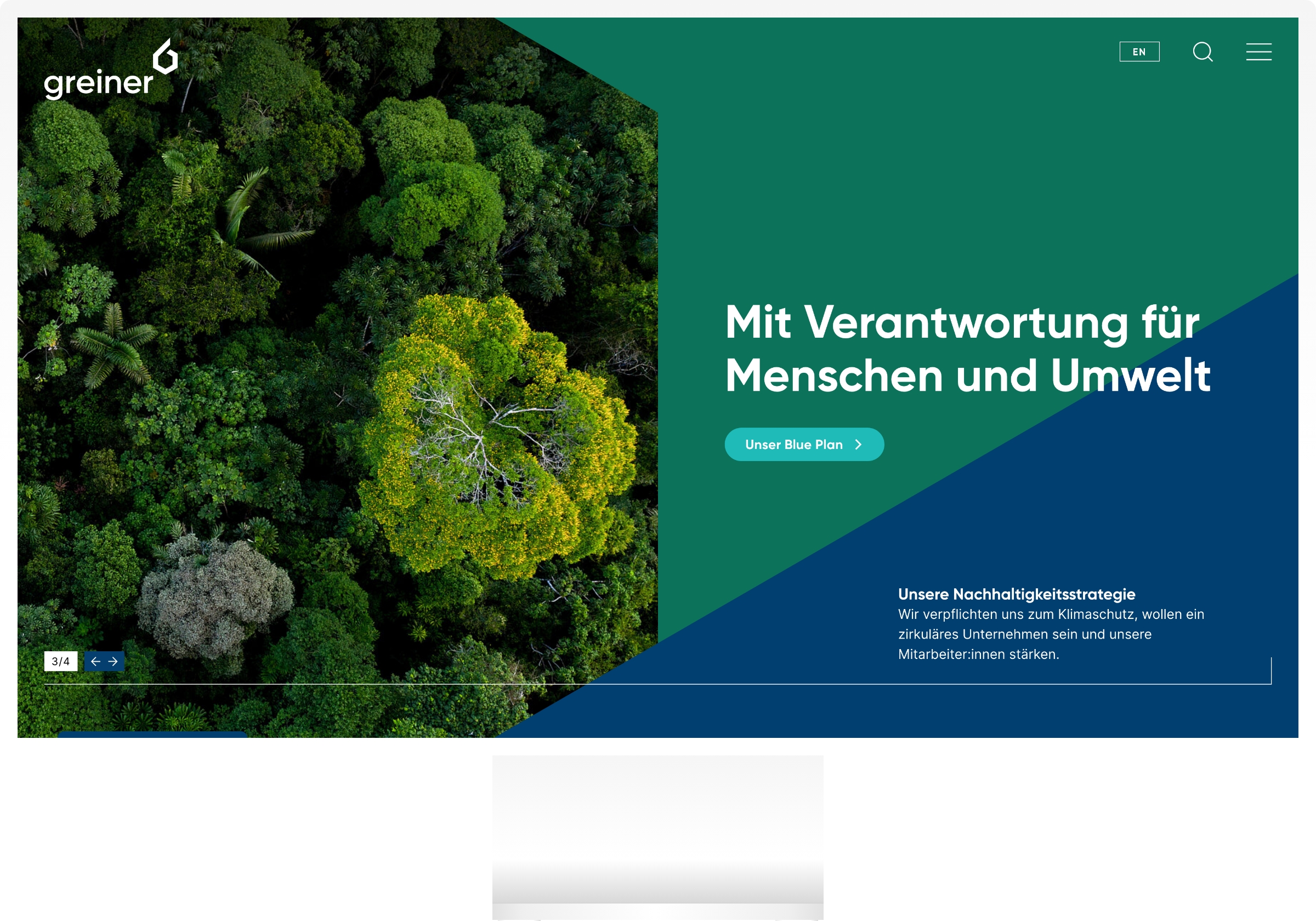
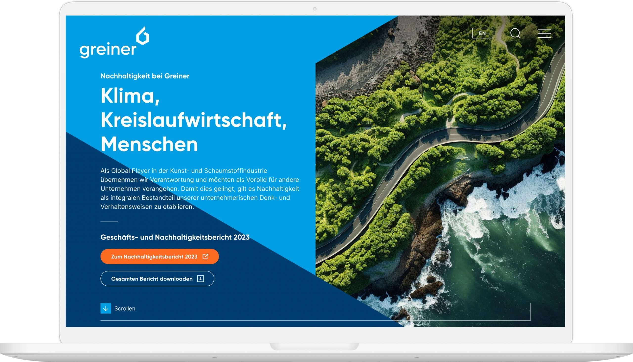
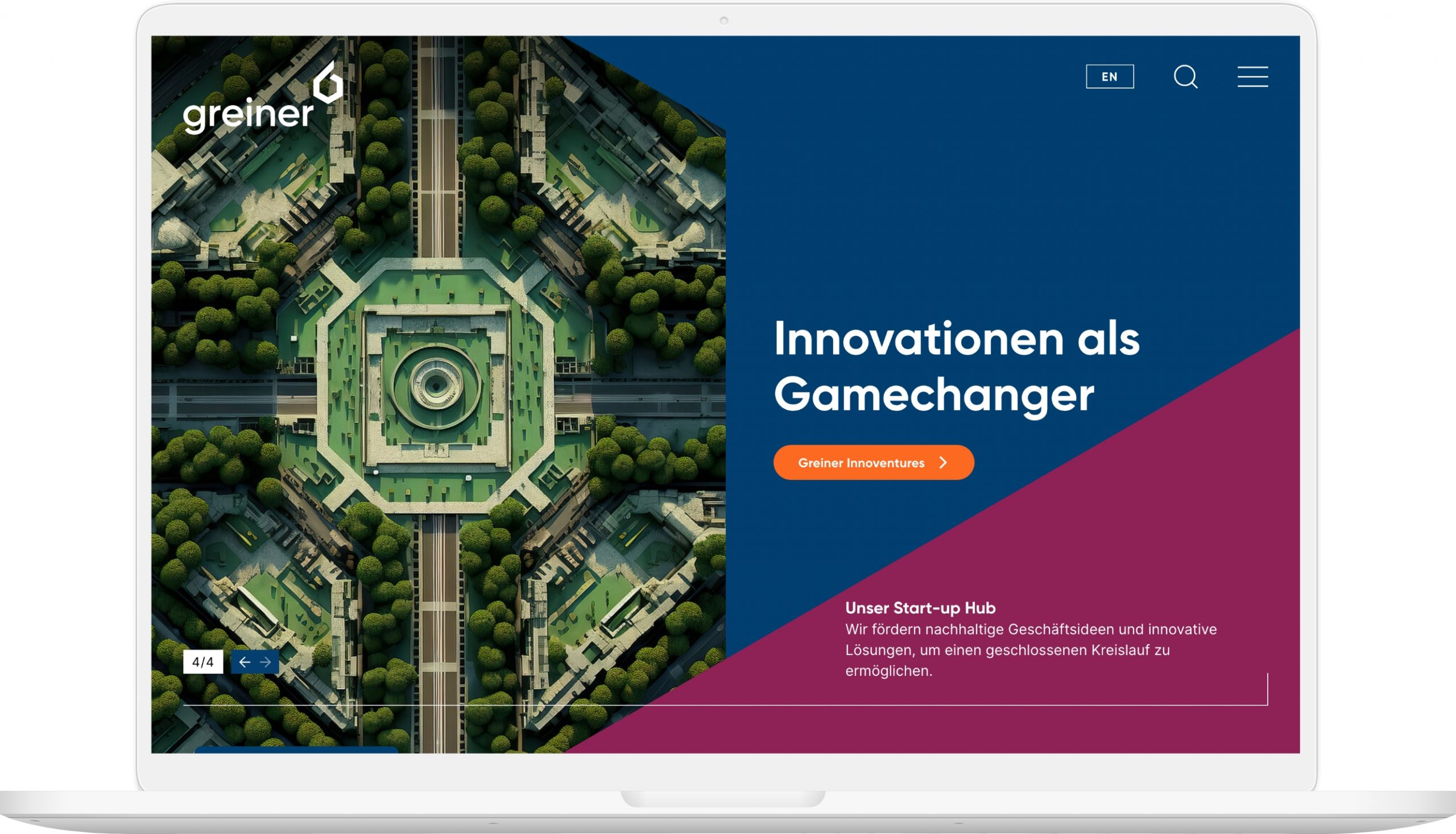
As part of the complete relaunch of the corporate website, several previously independent web properties were merged in order to improve orientation and user experience and reduce the further development and operating costs of the Greiner website landscape.
Strong storytelling, including the use of high-quality, large-scale videos as well as a simple overview and operation, including on smartphones, were at the centre of the UX and UI designs.
In terms of content, the press area is central: All information for journalists, a core target group of the website, is available in a media centre. A highly faceted search supports them in their research. Individual files can be downloaded from the overview with just one click.
Special attention was also paid to employer branding, including in the form of a dedicated website section for the target group of potential apprentices.
The corporate website was supplemented with easy-to-update microsites for the annual and sustainability reports.
Search engine optimisation (SEO) was taken into account throughout the entire project – from conception to technical implementation. The website was technically realised on the basis of the open source CMS TYPO3.
FONDA took on the complete conceptualisation of the project, developed the new corporate design and implemented the complete relaunch of the website.
‘The excellent result is primarily due to the trusting and highly professional collaboration between the great communications team at Greiner and our no-bullshit team.’
