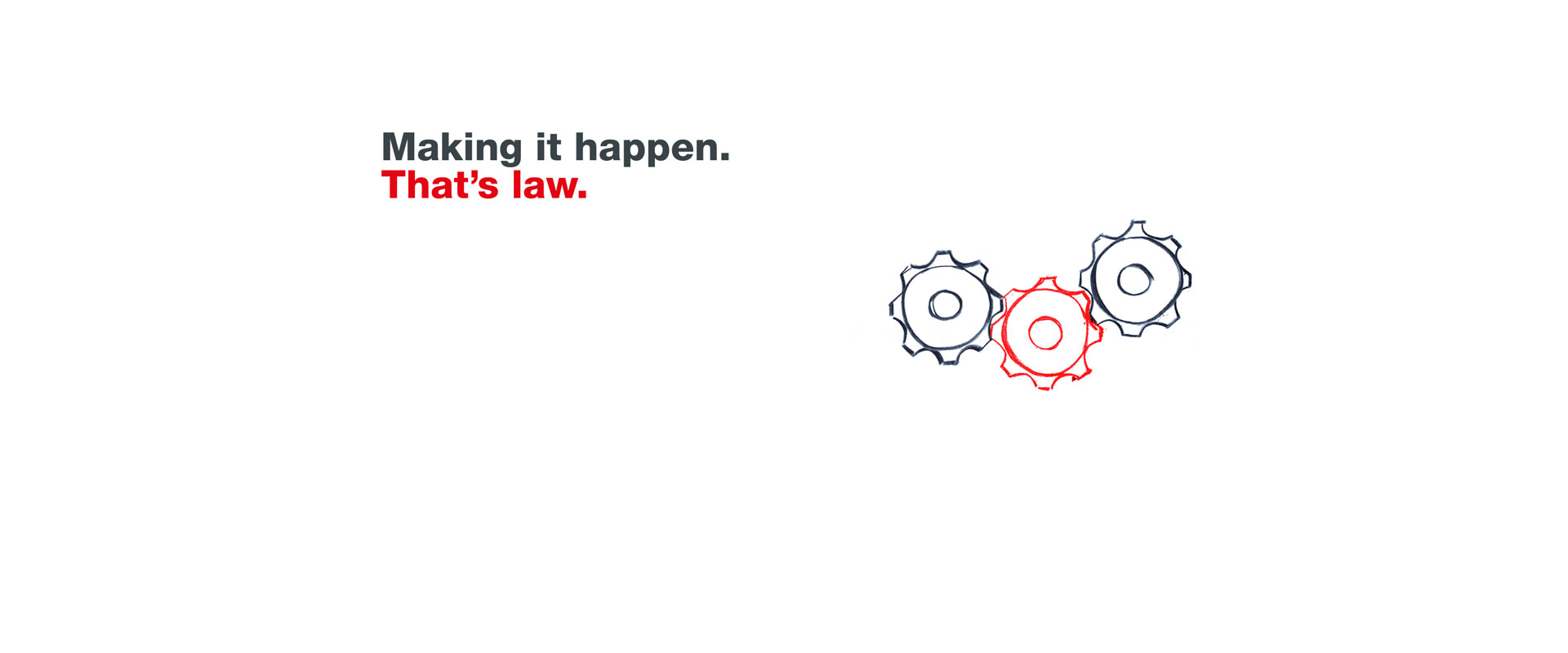
Eine Illustration von drei Zahnrädern.

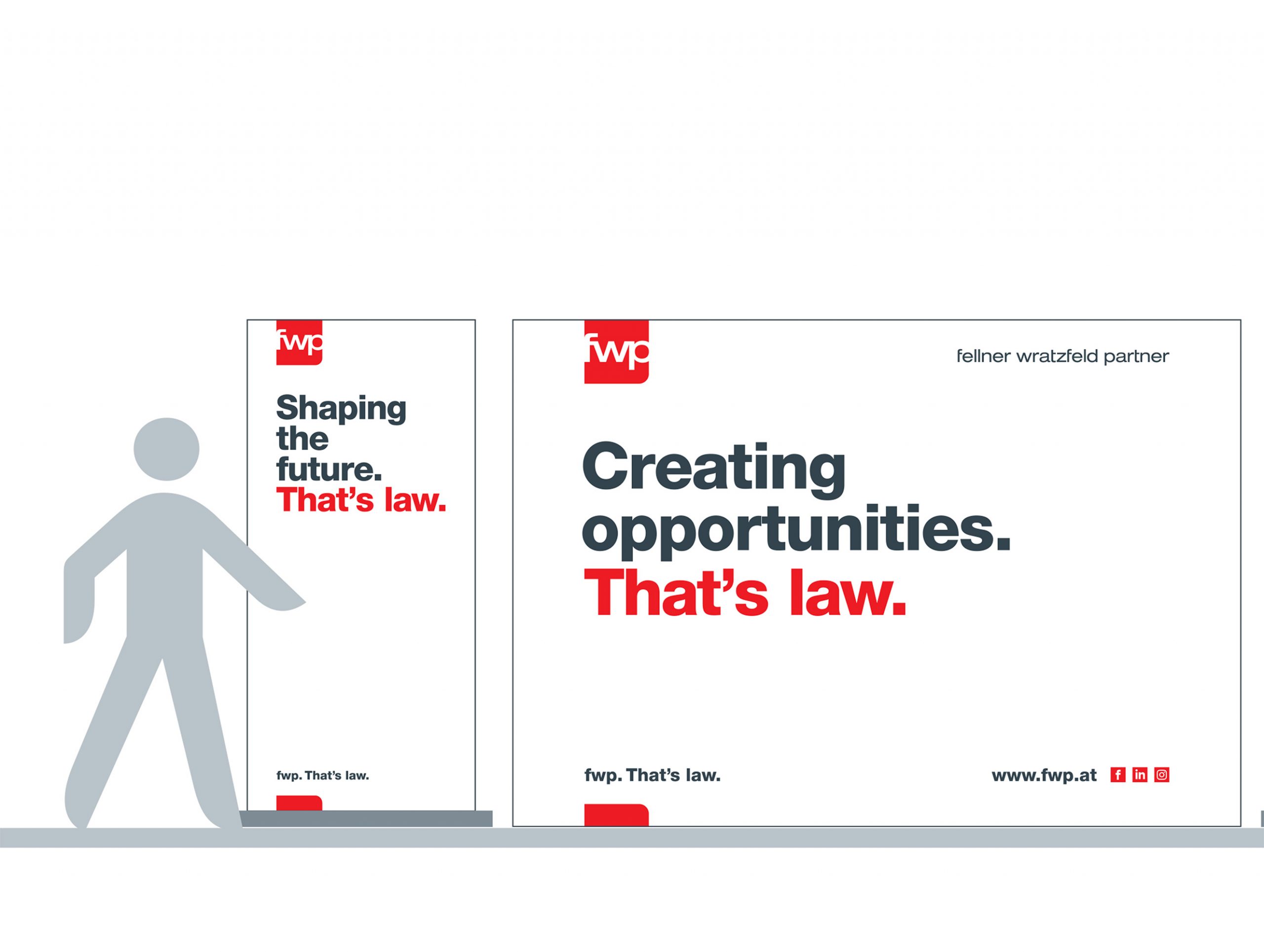
fwp. That’s law.

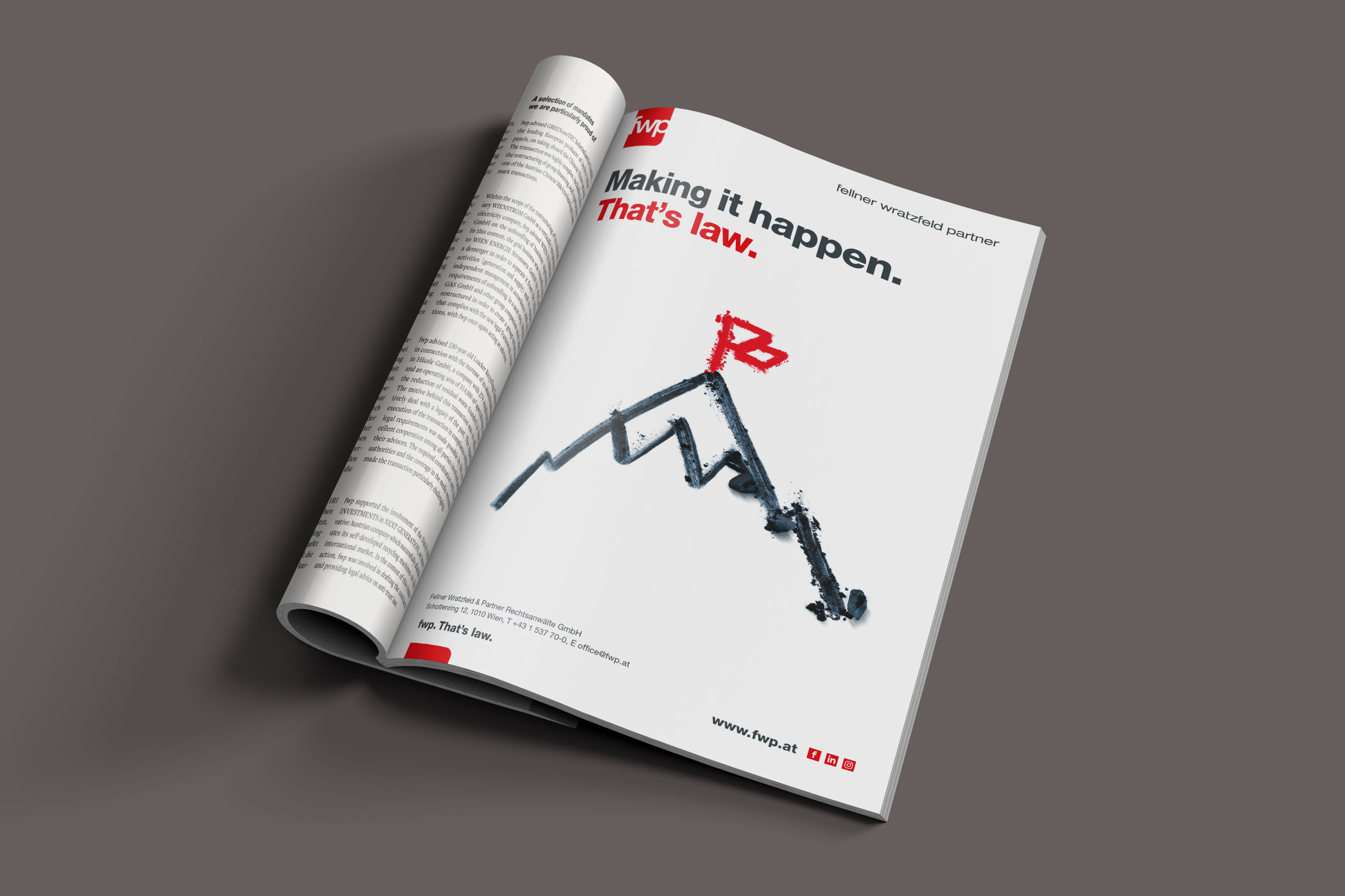
The Viennese business law firm Fellner Wratzfeld & Partner Rechtsanwälte (fwp) is one of Austria’s leading law firms in the field of business law, with around 130 highly qualified employees.

To continue to do justice to the increasing size and importance of the internationally active business law firm Fellner Wratzfeld & Partner Rechtsanwälte (fwp), it was necessary to position the fwp brand more precisely and to modernize communications.

The goal of the project was to create a new communications concept that was suitable for corporate and employer branding and could be used across all applications. Of course, the new concept also had to clearly stand out from the competition.

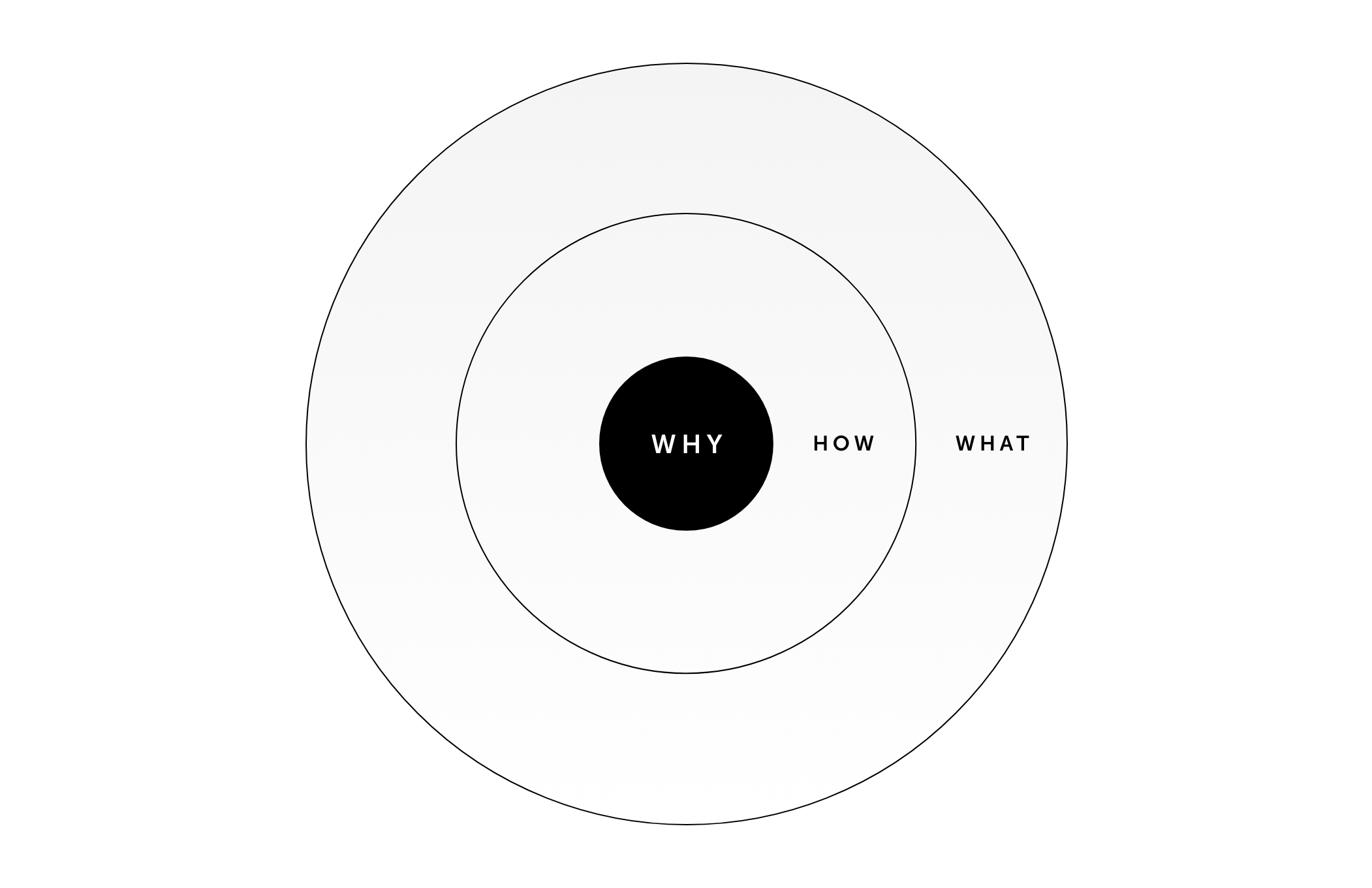
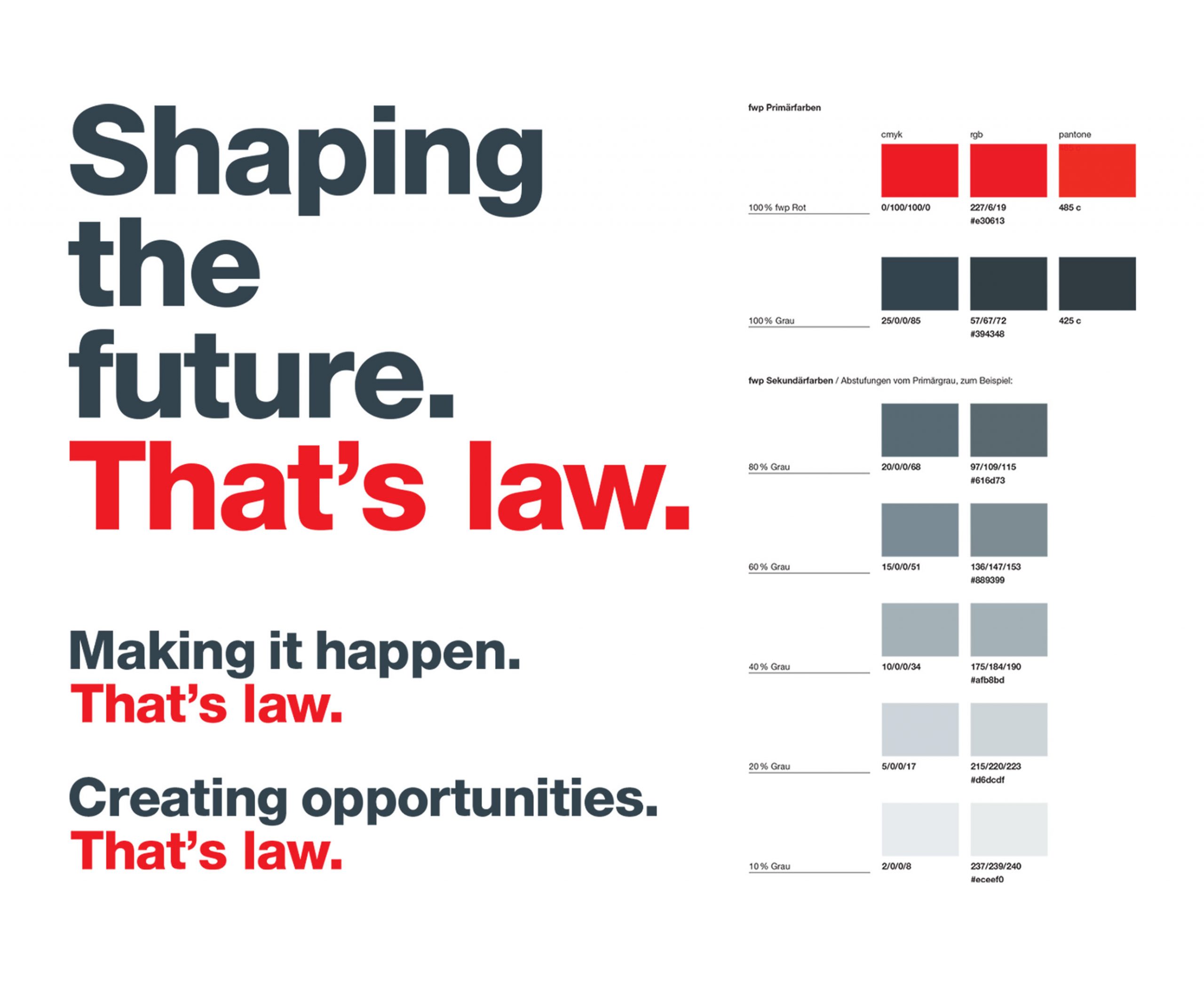
Zu sehen ist eine Grafik mit den Worten

Why do you do this?

In our search for the brand essence, we began with the question: why do lawyers do their job every day? What motivates them?

The Result

A new strong, consistent, yet highly authentic brand presence including an online presence that reflects the excellence and spirit of the law firm.

1.
Brand Development: The Question of Why
Brand positioning, brand values and the claim were developed in several meetings with the customer. On the one hand we focused on the needs of the target groups, and on the other on the motivation of the lawyers to provide a high level of performance every day.
2.
Analog for a Change: Illustrations with Charcoal
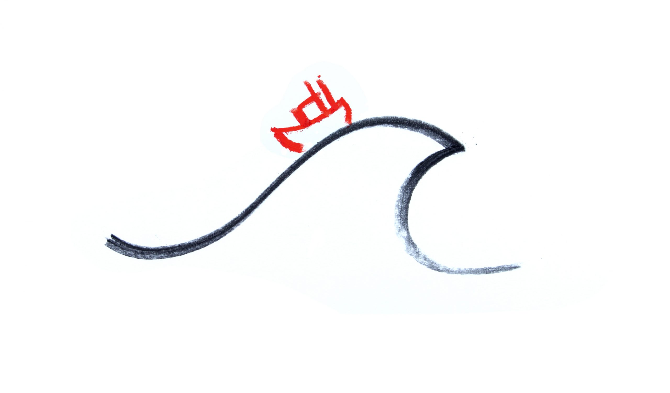
The existing corporate design was further developed: the new illustration design was created with pen and paper. A charcoal pencil draws strong lines. We liked that.
Visual einer Welle
3.
Online Presence with a New Image Concept
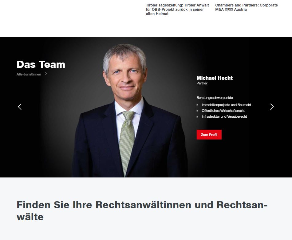
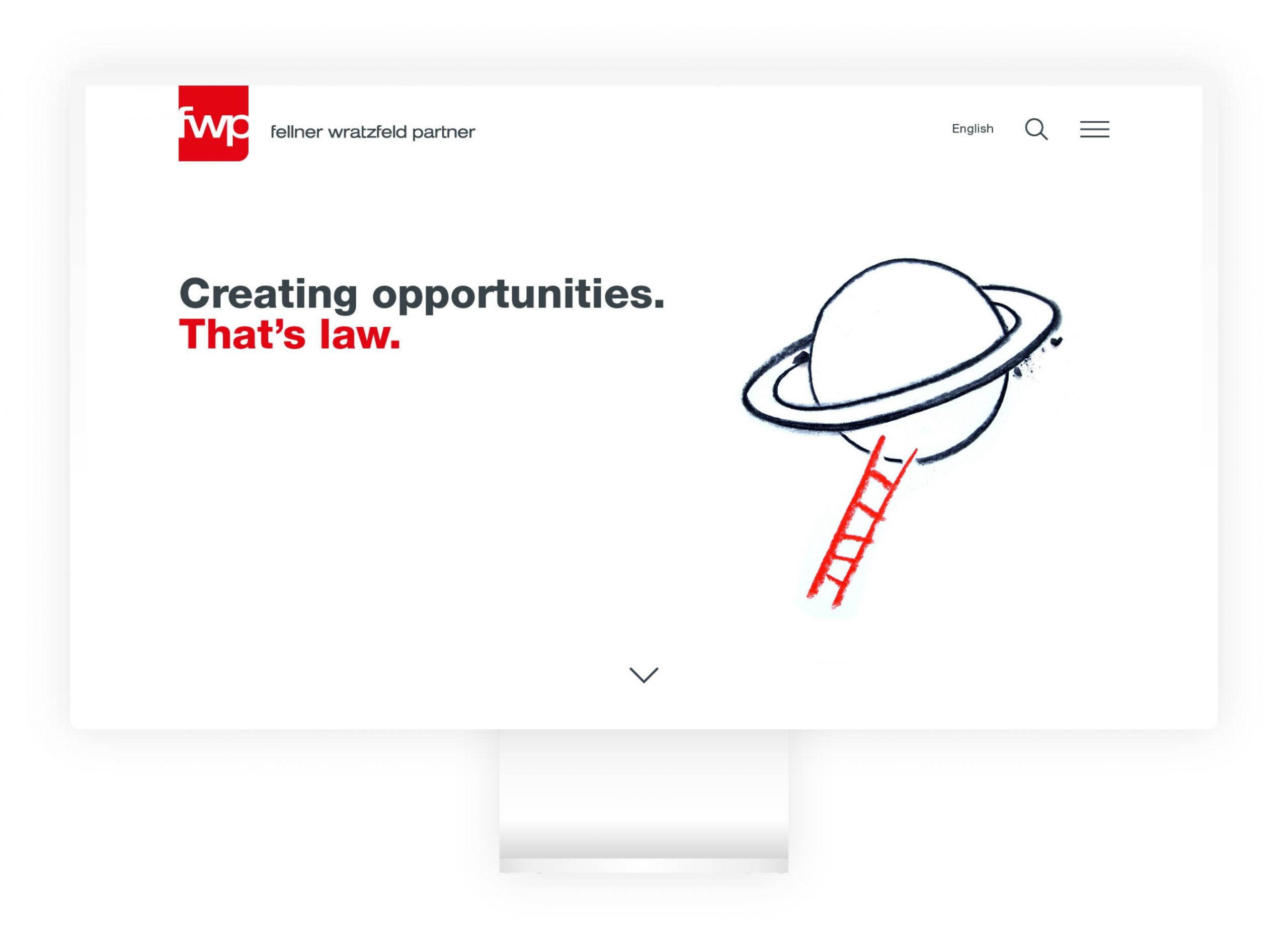
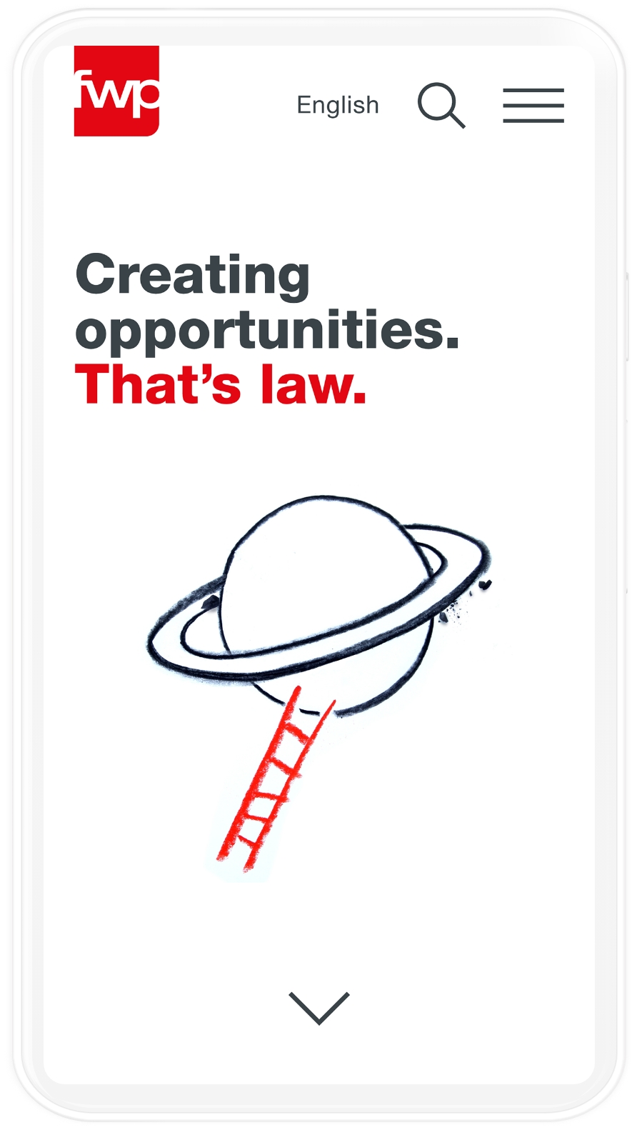
The new website was developed on the basis of the open-source content management system ibexa. The strong staging of the claim together with the animated illustrations ensure the independence of the brand. An essential part of the new website is the presentation of the lawyers with strong, large-scale images and a clear profile of their activities.
Ein Mann
4.
Rollout for Print and Co.
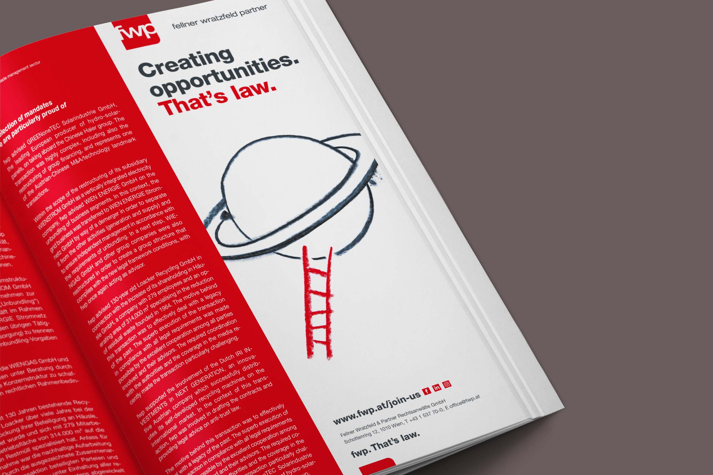
Whether print ads, presentation folders, Word and PowerPoint templates, bicycle racks, social media channels or job platforms - the new branding was eventually rolled out to all other means of communication.

“Our claim and website perfectly reflect who we are and what we stand for.”

Markus Fellner.
Partner FWP
Viewport der FWP Website Desktop

Stay in the Game.

All projects
Webseiten des Opec Funds auf Tablets
International Website-Relaunch
The Opec Fund
Webseiten des Opec Funds auf Tablets
International Website-Relaunch
The Opec Fund
High-Quality UX- and UI Design and Technical Implementation Based on IBEXA.
The Opec Fund
Logo von ÖPPM
Medicine, Completely Personal
ÖPPM
Logo von ÖPPM
Medicine, Completely Personal
ÖPPM
Brand identity and website for a platform for personalised medicine
ÖPPM
01 06
Swipe