Hier sieht man das Logo der FH Salzburg.

The Salzburg University of Applied Sciences website – anything but ordinary

Practical, strong in research and full of opportunities: The FH Salzburg offers its 3,000 students in the disciplines of engineering, social and economic sciences, design, media & art, and health sciences the best academic education with a high level of practical relevance, in a total of 30 bachelor’s and master’s degree programs.

The new FH Salzburg website should also reflect this innovative character and the professional learning environment of the university on the Internet. The perfect match for this project: our managing director, art director and user experience (UX) expert Hans Auer. He himself is a graduate of the FH Salzburg and is largely responsible for its new website.

Find A Future

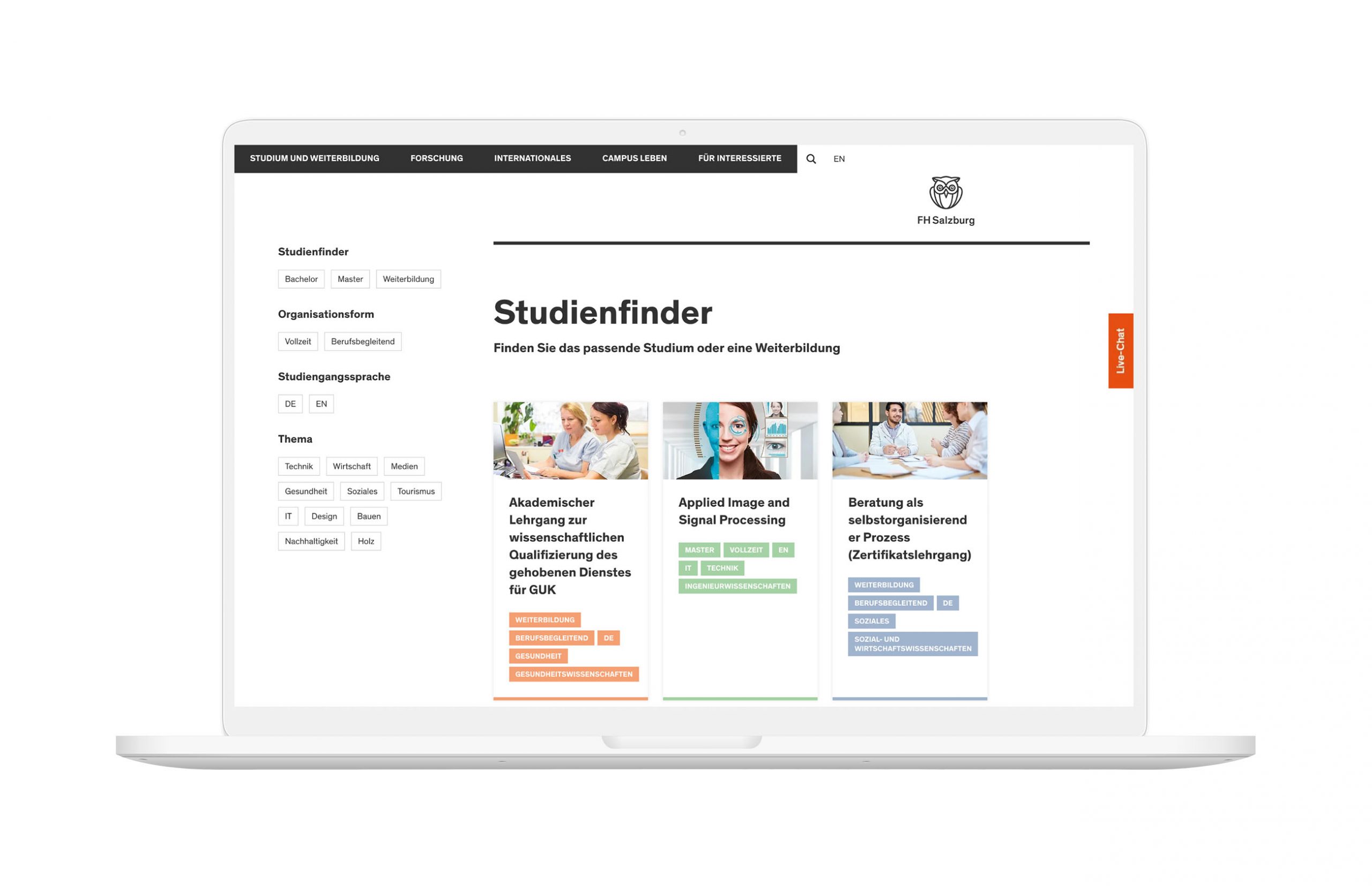
A central feature of the new website is the study finder with practical one-touch filters. This means that the right degree program can be found quickly.

Optimal User Experience (UX), Modern User Interface Design (UI) and Strong Storytelling

What do students, researchers and stakeholders of the FH Salzburg really want? With this central question in focus, our UX and UI experts worked with the University Communications & Marketing department, as well as representatives of the degree programs and other departments of FH Salzburg, in a series of workshops to define the new content and functions of the website.

The result is a completely new look for the website with sophisticated user interface design (UI).

UX, UI and frontend came from us. The backend was implemented on the basis of the TYPO3 content management system by plan2net.
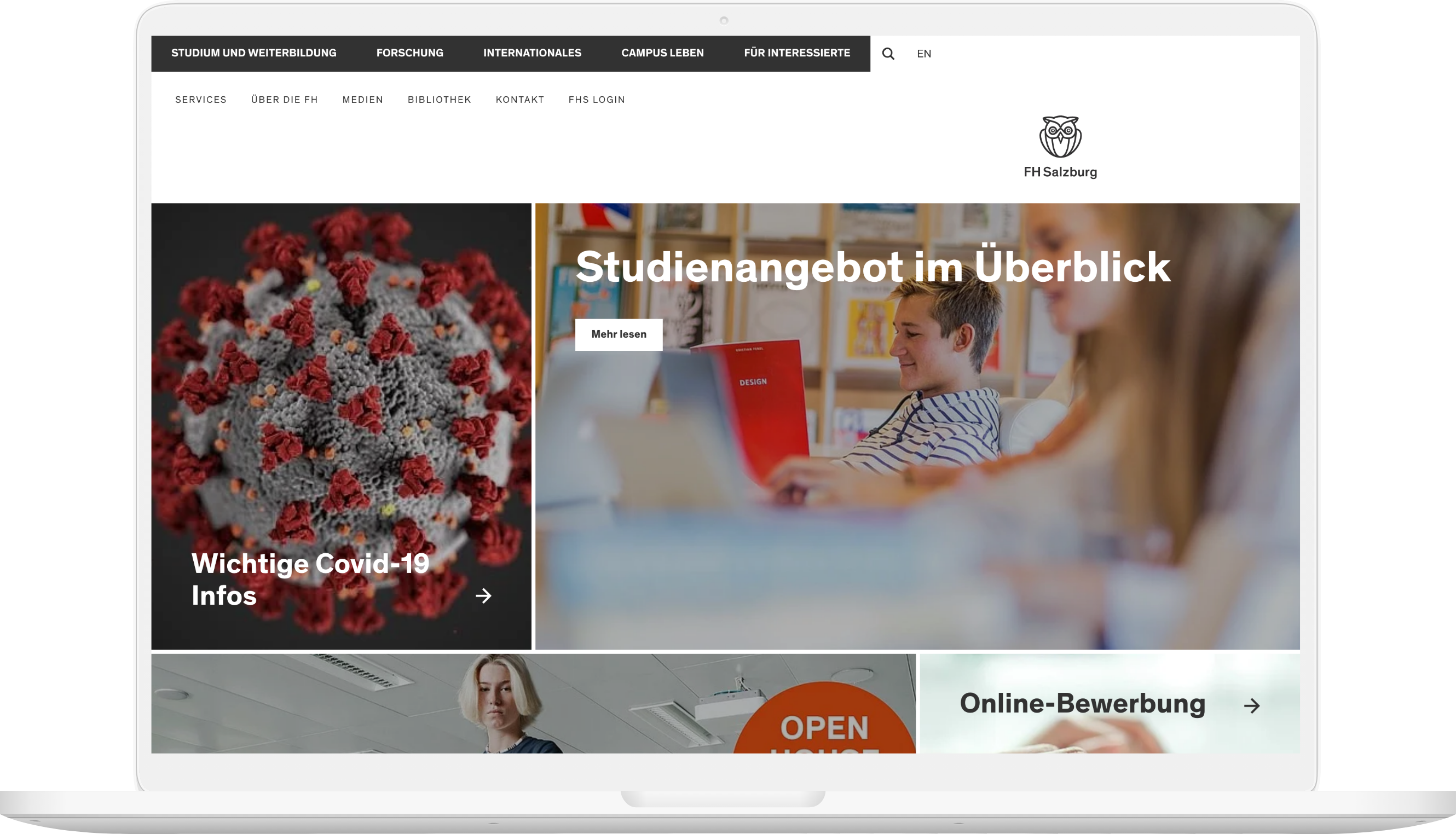
  • The large-scale, minimalist design with its strong visual language and deliberate use of typography structures the content and invites interaction.
  • Video modules showcase the quality of life on campus and the wide range of courses on offer.
  • A new type of menu navigation makes all areas accessible very directly – from study programs to research projects to news, interviews, and information about student life on campus.
  • Each study program is implemented as an independent search engine optimized (SEO) landing page, which provides a multimedia overview and leads to more in-depth information.
  • The extensive research areas of the FH Salzburg is also represented with their own landing pages.
  • The concept also relies on a high degree of emotionality and personal appeal, which is supported by strong storytelling.
Viewport der FH Salzburg website Tablet
Viewport der FH Salzburg website mobile
Studienfinder der FH Salzburg Tablet
Studienfinder der FH Salzburg Mobile

Stay in the Game.

All projects
OeKB Logo vor sonniger Berglandschaft
From communication concept to programming
OeKB
OeKB Logo vor sonniger Berglandschaft
From communication concept to programming
OeKB
Despite complex and demanding content and different target groups: Better Simple!
OeKB
Viewport der Startseite von Heintel auf Laptop vor blauem Himmel
Medical Technology Online Store
Heintel
Viewport der Startseite von Heintel auf Laptop vor blauem Himmel
Medical Technology Online Store
Heintel
Website with integrated medical technology online store
Heintel
01 06
Swipe